Updated July 12, 2026 · 11 min read
The short answer
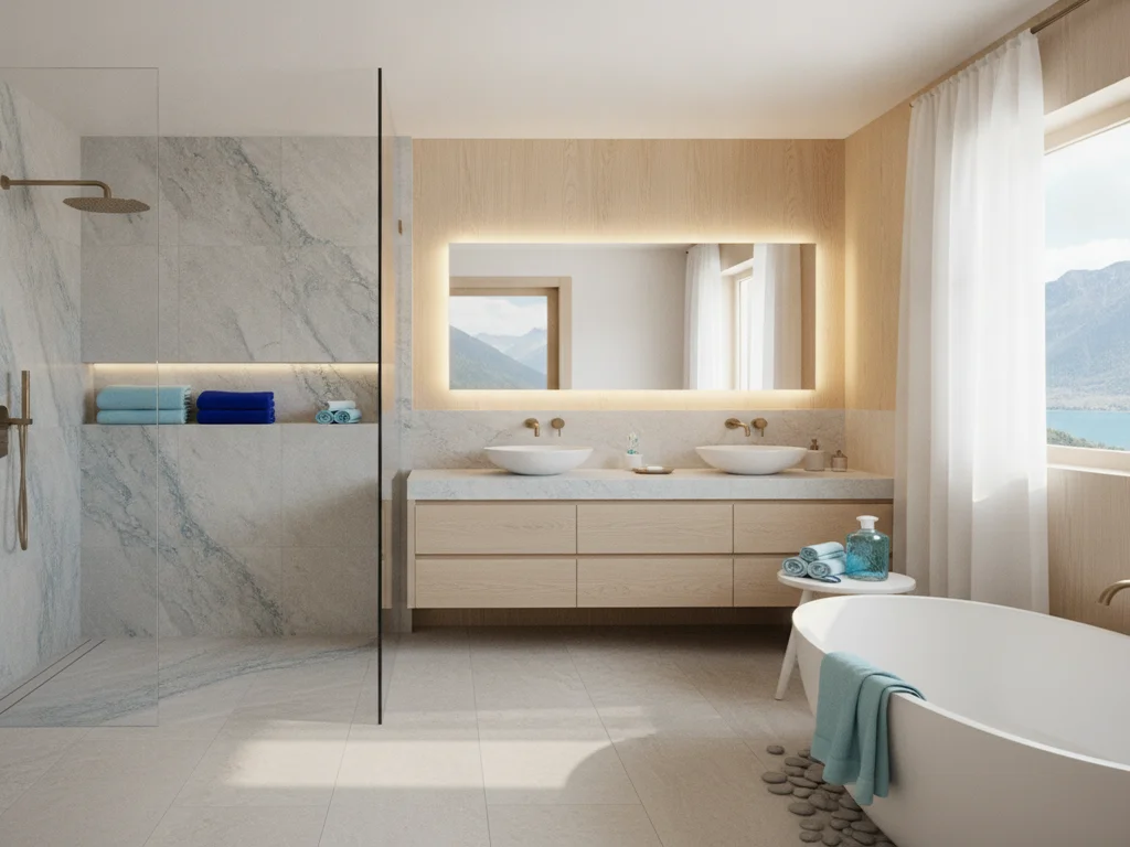
Build a bathroom palette in order of permanence: fixtures and tile first (10-20 year decisions, so keep them neutral), then paint and hardware last (the cheapest, fastest layers to update, so this is where trend color belongs). NKBA data shows off-white, light tan, and white dominate bathroom color choices, while a satin or semi-gloss paint — never flat — is what actually survives shower steam.
Key takeaways
- Sequence a palette by how expensive each layer is to change: tile and fixtures (10-20 years) should stay neutral; paint, hardware, and textiles (the cheapest, fastest layers) are where trend color belongs.
- NKBA's 2026 Bath Trends Report found 96% of designers cite neutrals — led by off-white (58%), light brown/tan (54%), and white (40%) — as the most popular bathroom palette, with sage and olive green rising as the leading accent tones.
- Sherwin-Williams and Benjamin Moore both steer bathroom walls away from flat paint: a satin or semi-gloss finish resists the moisture, scrubbing, and mildew a shower-adjacent wall takes on, while flat paint absorbs moisture and stains.
- A small or low-light bathroom reads larger and brighter with light, cool-neutral walls and a matching or lighter-toned vanity, while a bathroom with strong natural light can carry a deeper accent color without feeling closed-in.
- Pantone's 2026 Color of the Year, Cloud Dancer — a soft, structural white — reinforces the same direction NKBA's data shows: a calm neutral base is the safer long-term bet, with color doing its work through accents.
- A Pacific Northwest-inspired palette — driftwood tan, moss and sage green, slate blue-gray, warm white — pulls from the region's natural materials rather than a trend cycle, which is part of why it tends to age well in a Camas or Vancouver home.
Build the palette in order of what's hardest to change
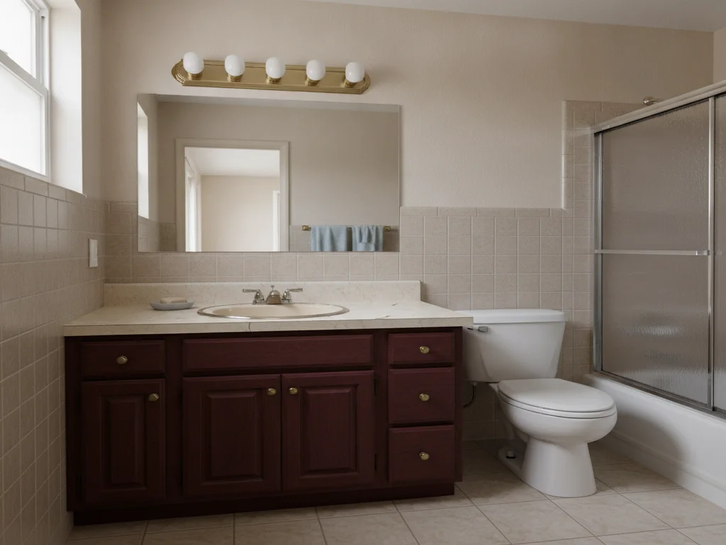
The most common mistake in bathroom color planning isn't picking an ugly color — it's picking colors in the wrong order. A wall gets repainted in an afternoon; a tile shower or a vanity gets replaced once every 15-20 years, if that. Choosing a trend-forward tile pattern and a safe, neutral paint color is backwards. The permanent layers should be the neutral ones, and the layers you can change in a weekend are where trend color belongs.
That means sequencing decisions like this: fixtures (tub, toilet, faucet finish) and tile (shower walls, floor) first, chosen to be genuinely timeless since they're the most expensive and disruptive to redo. Paint and hardware (cabinet pulls, towel bars, light fixtures) come last, and are the cheapest, fastest layers to refresh when a color falls out of favor. NKBA's planning guidelines exist for clearances and layout, but the same "plan for the long term" logic that governs a fixture's dimensions applies to its color.
Timeless vs. trendy: what the data actually shows
NKBA's 2026 Bath Trends Report, based on survey data from nearly 700 industry professionals, found that 96% of respondents identify neutrals as the most popular bathroom color palette right now — led by off-white (58%), light brown/tan (54%), and white (40%), well ahead of dark brown (30%), black (18%), and dark grey/slate (18%). That's not a fluke of one survey year; light neutrals have anchored bathroom design for well over a decade because they don't compete with tile veining, don't show water spotting the way saturated colors can, and don't date a room the way a specific trend hue does.
The same report found sage and olive — brown-based, muted greens — rising as the leading accent tones, ahead of bolder hues like teal/turquoise and emerald. That distinction matters: a muted, earthy green reads as a natural material color (moss, sage, olive) rather than a paint-chip trend, which is a large part of why it tends to age better than a saturated jewel tone. Pantone's 2026 Color of the Year, Cloud Dancer — described as "a billowy, balanced white imbued with a feeling of serenity" that pairs with natural wood and stone — points the same direction: a calm, structural neutral as the base, with color doing its work in smaller doses.
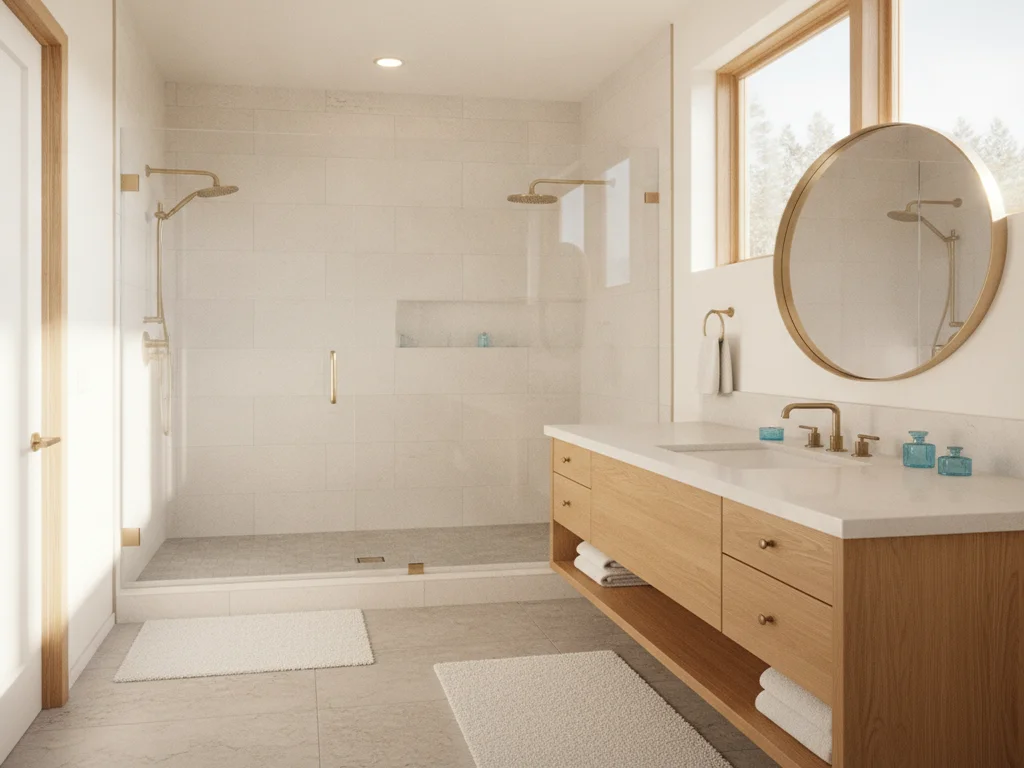
The practical read for a Camas or Vancouver bathroom: a neutral-to-earthy base (white, off-white, warm greige, or a muted sage) will outlast almost any trend cycle on your tile and cabinetry, and a bolder color — navy, deep green, terracotta — works best confined to something you can change cheaply, like an accent wall, vanity paint, or hardware finish.
How to build the palette: fixtures, tile, paint, hardware
- Fixtures first — Tub, toilet, and faucet finish set the undertone for everything else. White or off-white fixtures stay neutral almost indefinitely; a colored tub or sink (rare today, but common in older homes) locks the whole room's palette around it for as long as it stays installed.
- Tile second — Once fixtures are set, choose shower and floor tile to complement that undertone. This is the highest-cost, longest-lived decision in the room; see our shower wall materials guide for how material choice and color interact, and our custom tile and stonework work for what's achievable in a Camas remodel.
- Paint third — With fixtures and tile locked in, paint is the layer that can carry more personality, because it's the cheapest to change later. Pull the wall color from an undertone already in the tile or stone rather than picking it in isolation.
- Hardware and accents last — Faucet, cabinet pull, mirror frame, and light fixture finishes (matte black, brushed nickel, warmer brass tones) plus towels and textiles are the fastest and cheapest way to refresh a room's look without touching tile or paint at all.
Bathroom-rated paint: sheen matters more than color
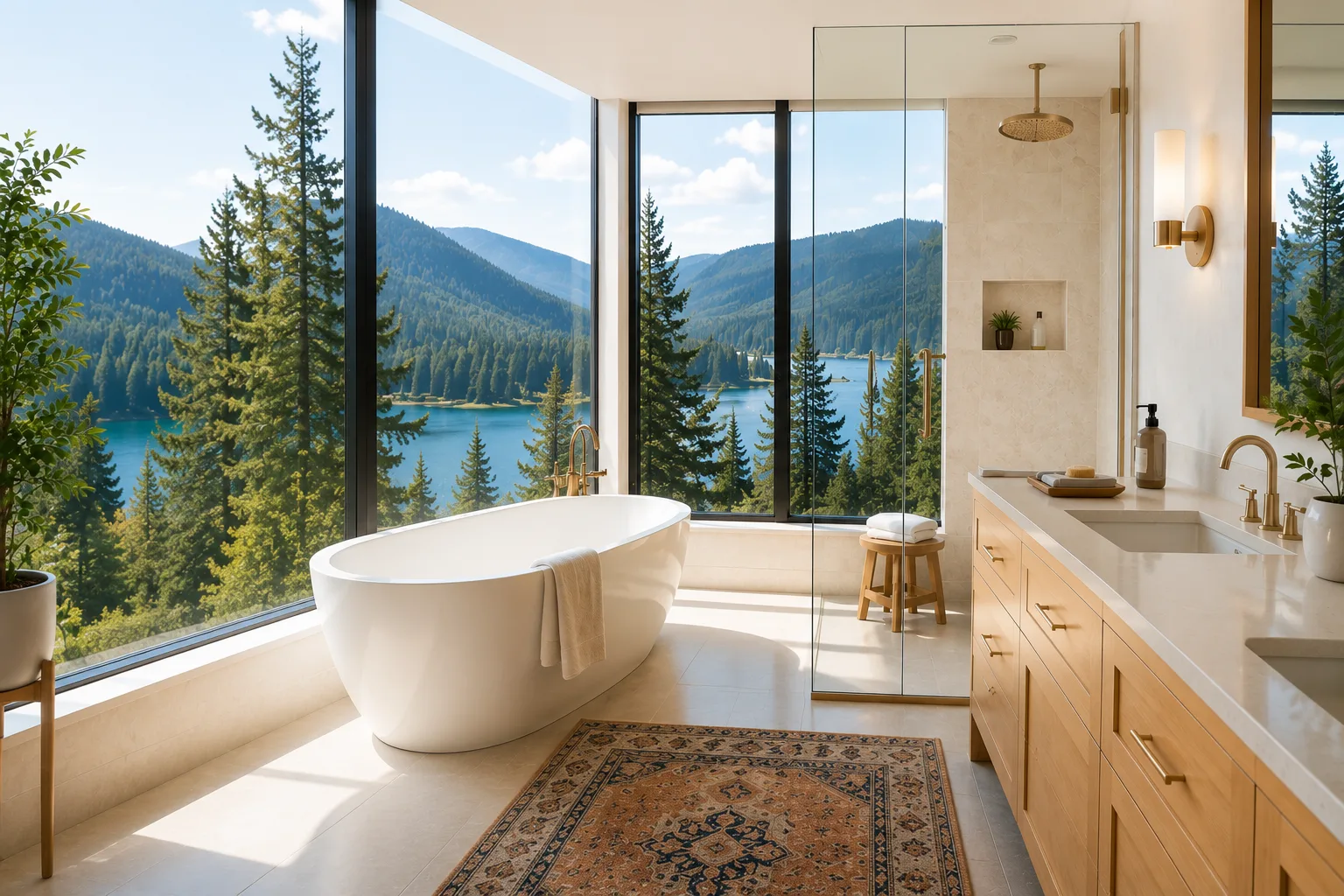
A steam shower puts more moisture on a bathroom wall than almost any other room in the house sees, and flat or matte wall paint isn't built for it. Sherwin-Williams' sheen guide recommends satin or semi-gloss for bathrooms specifically because those sheens "can withstand moisture" — the harder, smoother surface resists water, soap scum, and the scrubbing a bathroom wall needs, where a flat finish absorbs moisture and stains more easily.
Benjamin Moore's Kitchen & Bath paint line takes the same logic further with a satin finish formulated specifically to resist mildew in high-humidity rooms — a meaningfully different product than a standard wall paint in the same color. In a marine climate like ours, where indoor humidity runs higher than the national average for more months of the year, that difference isn't cosmetic; see our marine climate moisture control guide for how humidity affects the whole room, not just the paint film.
The practical rule: pick color first, then confirm it's available in a satin or semi-gloss bath-and-kitchen line before committing — almost every major manufacturer now makes a moisture- and mildew-resistant version of its standard interior paint, and it typically costs only a little more than the standard line.
Skip flat paint on bathroom walls
Flat and matte finishes absorb moisture and are difficult to wipe clean, which is why both Sherwin-Williams and Benjamin Moore steer bathroom walls toward satin or semi-gloss instead. Reserve flat paint for a powder room with no shower or tub.
Color strategy for light and small bathrooms
A bathroom's natural light and square footage should drive the palette as much as personal taste does. A small or windowless bathroom — common in older Camas and Vancouver homes — reads larger and brighter with light, cool-leaning neutrals on the walls, and gains more from keeping wall and vanity tones close together than from any single "make it look bigger" trick; a hard contrast between a dark vanity and a bright wall visually chops the room into pieces. See our small bathroom ideas guide for the layout side of that same problem.
A bathroom with strong natural light — south-facing windows, a skylight, a larger primary suite — can carry a deeper accent color (navy vanity, sage tile, a moody accent wall) without feeling closed-in, because the light offsets the visual weight. The rule of thumb: the less natural light a room gets, the lighter and cooler its base palette should be; the more light it gets, the more a saturated color can work in a smaller dose, like a vanity or an accent wall rather than all four walls.
Sheen plays a role here too — a satin or semi-gloss wall finish reflects more ambient light than a flat one, which is a second reason (beyond moisture resistance) it tends to work better in a small or dim bathroom.
PNW-inspired natural palettes
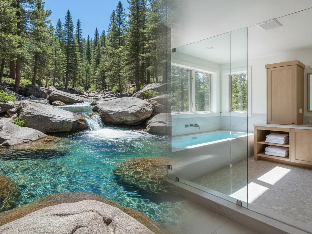
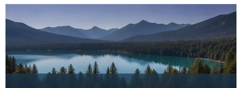
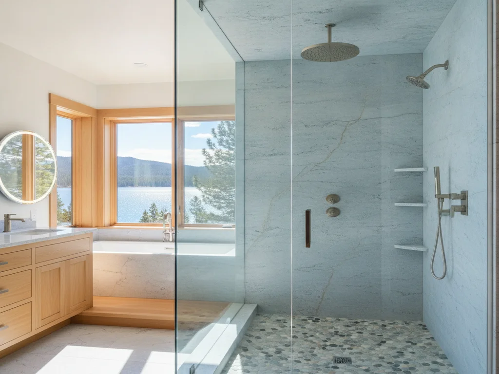
Rather than chasing a national color trend, a lot of the most durable bathroom palettes in this region pull directly from what's already outside the window: driftwood tan and warm greige, moss and sage green, slate blue-gray pulled from an overcast sky or river stone, and a warm off-white rather than a stark, cool white. It's the same direction NKBA's data points to nationally — neutrals with an earthy green accent — but grounded in materials that are genuinely local rather than a paint-chip trend that will look dated in a decade.
That palette pairs naturally with the materials already common in Camas and Vancouver remodels — natural stone and wood-look tile, matte black or brushed brass hardware, wood vanities. Our bathroom fixtures and hardware guide covers how finish choices interact with a palette like this in more depth, and a full bathroom remodel is where all of these layers — fixtures, tile, paint, hardware — get sequenced together instead of picked one at a time.
Putting it together
The through-line across NKBA's data, the paint manufacturers' technical guidance, and basic durability logic is the same: keep the expensive, hard-to-change layers of a bathroom neutral, and put trend color where it's cheap to update. That approach doesn't mean a boring bathroom — a muted sage vanity, a navy accent wall in satin, or brass hardware against a warm white all carry real personality while keeping the tile and fixtures underneath timeless.
If a full remodel is on the table, the palette conversation works best alongside the layout and material decisions, not after them — our full bathroom remodeling team in Vancouver, WA walks through fixtures, tile, and finish sequencing together during design.
Ready to plan your Clark County bathroom?
Licensed & insured · 3-year workmanship warranty
Frequently asked questions
- What is the most timeless bathroom color scheme?
- NKBA's 2026 Bath Trends Report found 96% of design professionals cite neutrals — off-white, light tan, and white — as the most popular and durable bathroom palette. Pairing a neutral tile and fixture base with a muted earthy accent (sage, olive, driftwood tan) tends to age the best, since it avoids both a dated saturated trend color and a stark, sterile all-white look.
- What paint sheen should I use in a bathroom?
- Satin or semi-gloss, not flat or matte. Both Sherwin-Williams and Benjamin Moore recommend satin or semi-gloss for bathroom walls because those finishes resist moisture, scrubbing, and mildew far better than a flat finish, which absorbs moisture and stains more easily. Look for a manufacturer's kitchen-and-bath line specifically — it typically adds mildew-resistant additives on top of the sheen itself.
- How do I choose a color for a small or dark bathroom?
- Favor light, cool-leaning neutrals on the walls and keep the vanity tone close to the wall color rather than in high contrast — that combination reads as one continuous space instead of a cut-up room. A satin or semi-gloss finish also reflects more ambient light than flat paint, which helps in a room with limited natural light.
- Should tile and fixtures be a color, or stay neutral?
- As a rule, keep the layers that are expensive and disruptive to replace — tile, tub, toilet, faucet finish — in a durable neutral, since they typically last 15-20 years. Save trend color for paint and hardware, which can be updated in a weekend for a fraction of the cost of retiling a shower.
- What is a Pacific Northwest-inspired bathroom color palette?
- A palette pulled from regional materials rather than a national trend: driftwood tan, warm greige, moss and sage green, slate blue-gray, and a warm off-white. It pairs naturally with natural stone, wood-look tile, and matte black or brushed brass hardware common in Camas and Vancouver remodels, and tends to age better than a palette chosen from a single year's trend report.
Sources
- NKBA | KBIS — 2026 Bath Trends Report
- NKBA — Kitchen & Bath Planning Guidelines
- Sherwin-Williams — Paint Sheen Guide
- Benjamin Moore — Kitchen & Bath Paint (Satin)
- Pantone — Color of the Year 2026
Claims and figures are drawn from the sources above and provided for general guidance; your project may vary. Photography is illustrative of design concepts. For a fixed price on your specific bathroom, request a free estimate.